



“Vocabulary is infrastructure. When it's shared, everything built on top of it moves faster. When it's not, every conversation carries a hidden translation tax that nobody has budgeted for."
Years ago, at a previous company, I spent the better part of a month arguing with a development manager about components. We were both smart, experienced people. We were both talking about “components.” And we were talking about completely different things.
When I said component, I meant the smallest meaningful element of UI. A button. An input. A badge. The atomic stuff you build everything else from.
When he said component, he meant a feature-complete CMS module. A whole promotional banner with its content model, its editorial workflow, its publishing rules. To him, a “component” was something a merchandiser could drop onto a page and configure.
So when I said “we have 40 components ready,” he heard “40 page modules are done” and started making commitments to stakeholders. When he said “this component is blocked,” I heard “a button is broken” and couldn’t figure out why the whole release was slipping. Neither of us was wrong. We were just running two different dictionaries through the same word.
Then it happened again at another company. Same word, same collision, different people. Which is when I stopped treating it as a personality problem and started treating it as a systems problem (and perhaps a “me exhibiting symptoms of the Dunning-Kruger effect” problem).
The fix, both times, was unglamorous. Define the terms. Write them down. Socialize them relentlessly across every function, so that a designer, a developer, a product manager, and a content strategist all mean the same thing when they say the same thing. It felt almost too basic to be worth the effort. It cut our design-to-dev back-and-forth dramatically. Vocabulary is infrastructure. When it’s shared, everything built on top of it moves faster. When it’s not, every conversation carries a hidden translation tax that nobody has budgeted for.
I bring this up because I recently got to apply that lesson to my own taxonomy, and it went somewhere I didn’t expect.
The stack, and the gap in the middle of it
Our composability model has five layers. Each one is built from the layer below it:
Design tokens → Base components → Patterns → Sections → Layouts
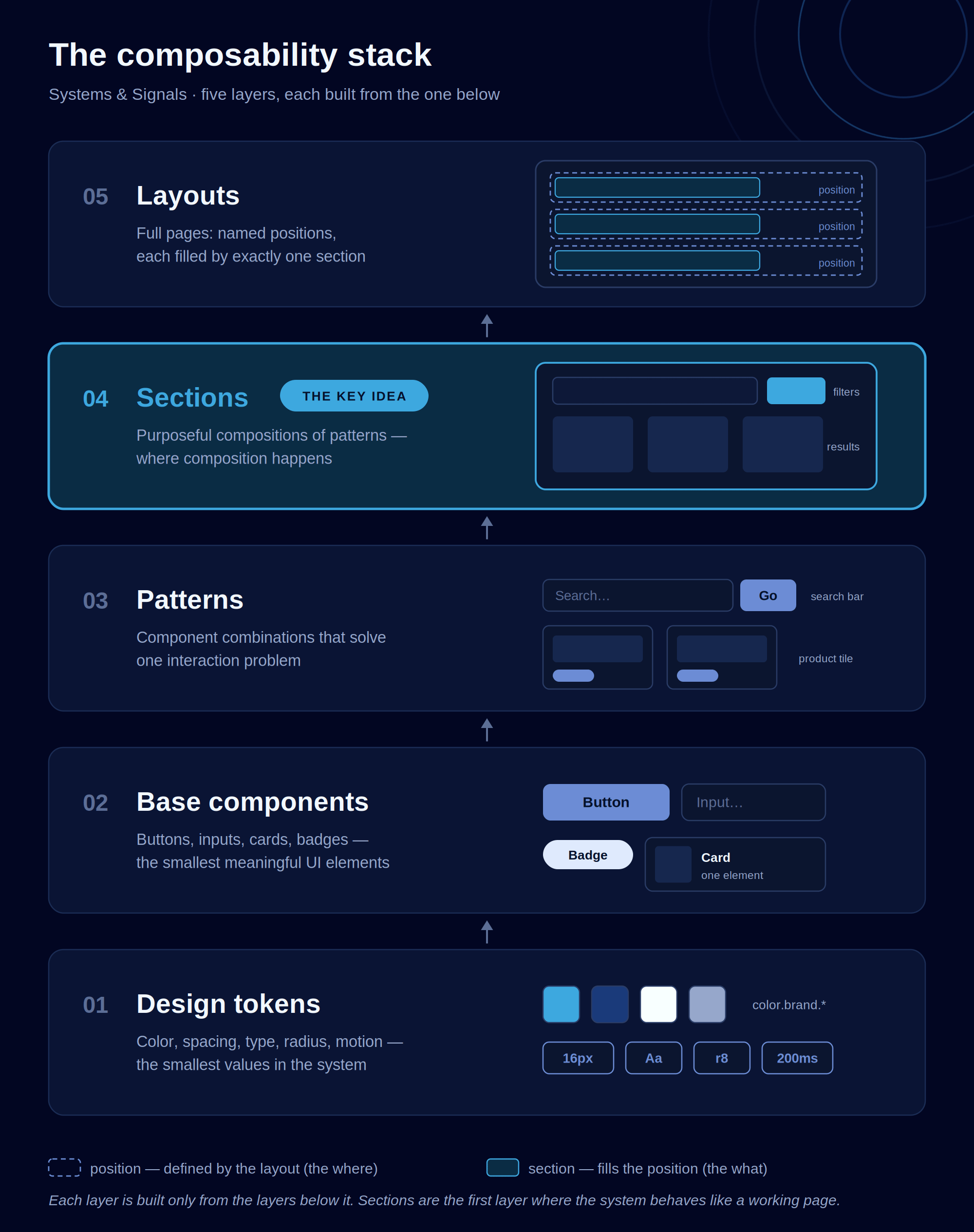
Tokens are the smallest values: color, spacing, type, radius, motion. Base components are buttons, inputs, cards, badges, built from those tokens. Patterns are small, purposeful combinations of components that solve one interaction problem: a search bar, a form group, a product tile.
Most design system literature covers those three layers well, then jumps straight to “pages.” Atomic design gestures at the space between with “organisms,” but in practice most teams treat organisms as big components and skip from patterns to full layouts, losing something important in the jump.
That something is the section.
A section is a collection of interrelated patterns that serve a specific purpose or design goal. It’s not a single component and it’s not a full page. It’s a named, purposeful region that a layout can place, remove, reorder, or reuse as a unit. If you’ve ever caught yourself describing “the part of the page that handles filtering” or “the part that shows related items,” you were describing a section. You just may not have had a settled word for it.
Sections are also where the system stops being a parts catalog and starts behaving like a working page. Tokens, components, and patterns are static building blocks. Sections are where composition actually happens.
Two kinds of sections
Every section is one of two things, and knowing which one you’re building changes how you wire it.
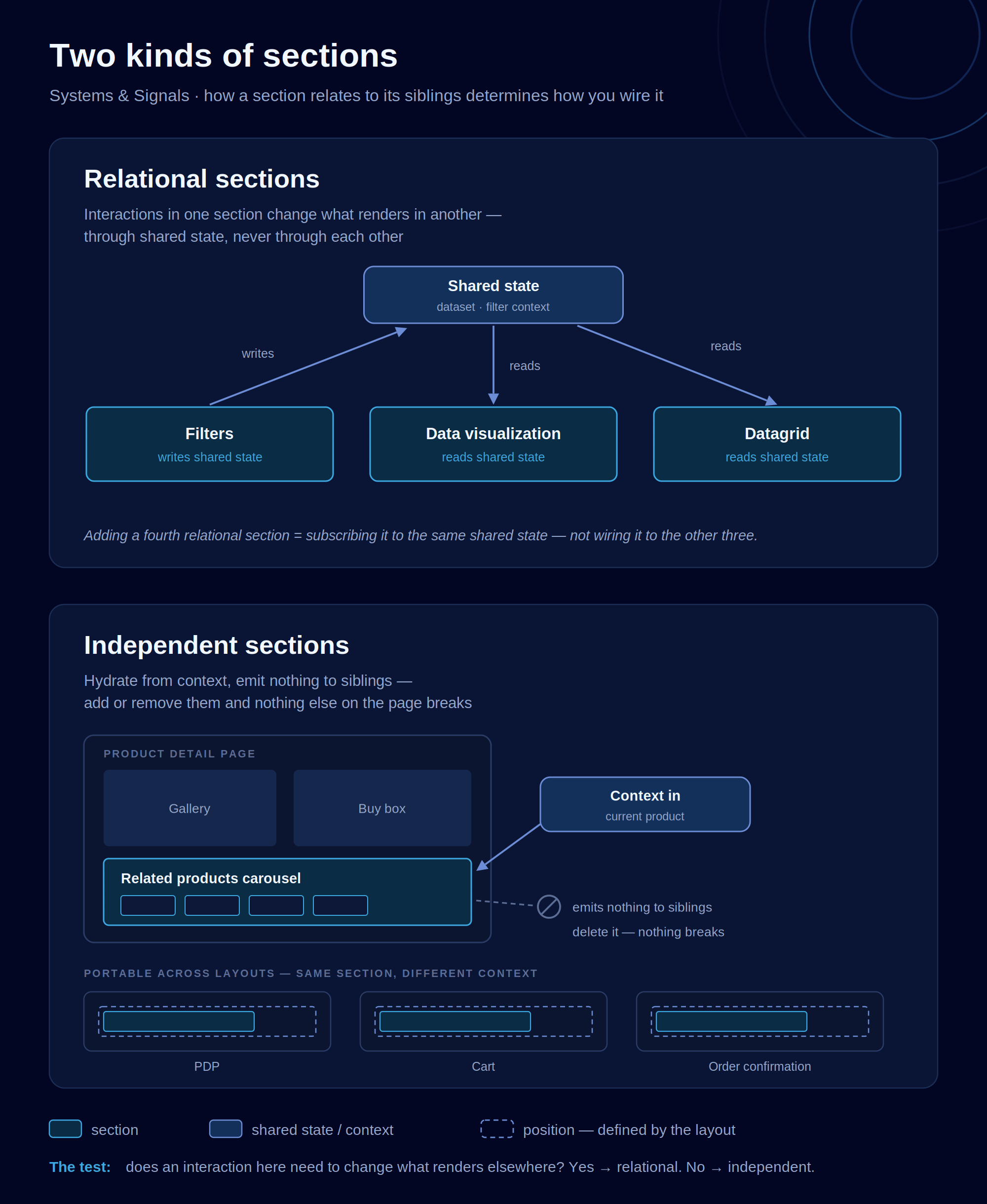
Relational sections relate to and influence one another. Picture a search results page with three regions stacked top to bottom: Filters, a data visualization, and a data grid. Change a filter and the loaded dataset changes. That change shows up in both the visualization and the grid. Neither downstream section knows how the other renders. They just both consume the same updated dataset from a common source.
That last part matters. Relational sections share state through a common source, not through direct section-to-section wiring. Filters should never call the chart directly. If you add a fourth relational section to that page, it subscribes to the same shared state. You don’t wire it individually to the other three.
Independent sections stand alone. The classic example is a product carousel on a product detail page. It’s hydrated with context, so the related products it shows actually reflect what you’re viewing. But scrolling it, tapping it, even adding an item to your cart from it changes nothing else on the page. You can delete it from the layout and nothing breaks. That same carousel can live on the PDP, the cart, and the order confirmation with zero structural changes. Only the context passed in is different.
The test I give teams is simple. Does an interaction inside this section need to change what renders somewhere else on the screen? If yes, it’s relational, and your job is to find the shared state. If it only needs context to hydrate its own content, it’s independent. And if you think a section is independent but deleting it would break a sibling, it isn’t independent. You’ve found a hidden dependency, and hidden dependencies are exactly the kind of thing a taxonomy exists to surface.
One naming rule we enforce: name the section by its purpose, not its parts. It’s “Filters,” not “Chip Group + Dropdown.” The moment you name a section after its patterns, you’ve coupled the name to an implementation that will change, and you’ve made the name useless to anyone outside the team that built it.
The term I almost shipped
Here’s a confession. This layer wasn’t always called sections in my head.
I learned the concept researching Airbnb’s server-driven UI platform, Ghost, where the backend controls layout, data, and even interactions across web, iOS, and Android from a single response. Airbnb calls their version “sections,” arranged by “screens.” Shopify landed on “sections” too. But as I adapted the idea, I started building out a richer vocabulary of my own. I split the concept in two: the “section” would be the purposeful composition of patterns, and a “slot” would be the named position in a layout that a section fills. The where and the what, each with its own term. Layouts define slots. Sections fill them. Elegant. I was proud of it.
Then I ran it through the same test my component wars taught me, and it failed.
Not on precision. On audience. A taxonomy exists so a designer, a PM, a content strategist, and a merchandiser can all discuss the system without translation. Every one of those people can point at a page and say “the filters section.” None of them will ever need to say “slot” to do their job. A merchandiser doesn’t reason about insertion-point contracts. They reason about what’s on the page and in what order. I was about to add a term that served maybe a fifth of my audience and confused the rest, which is precisely the failure mode I lecture other people about.
There was a collision problem too. “Slot” already means something specific in front-end engineering. Web Components have a literal slot element, and Vue uses slots as named insertion points inside a single component. My devs would hear the code meaning every time I meant the taxonomy meaning. I had, in miniature, recreated my own component wars, and this time I was the dev manager.
So I cut it. The concept didn’t go anywhere. It got absorbed into the layer above: a layout defines named positions, each filled by exactly one section, with a contract for what context flows in. “Position” is a plain word nobody needs training to understand. And in engineering documentation, where the rigor genuinely matters, the word slot survives as implementation vocabulary, where the Web Components collision flips into alignment, because a layout position may literally be implemented as a slot element. Two vocabularies, one documented mapping, each serving its actual audience.
The lesson I keep relearning: a taxonomy is not a maximally precise ontology. It’s the smallest set of terms your whole organization can hold the same way. Every term you add has to be defined, written down, and socialized relentlessly, and that effort doesn’t scale. Five terms you can hold the line on beat six where one is wobbly. Sometimes the most disciplined naming decision is deletion.
Where this goes: AI and hyper-personalization
Now the part I find genuinely exciting, and a little bit vertiginous.
Once you have sections as a first-class layer, filling governed positions in layouts, you have the natural unit for AI-driven personalization. Not “the algorithm rewrites your page,” which is chaos, but something much more governable.
Start with what independent sections already do: they read context to hydrate themselves. Current product, current surface, current customer state. The first extension is letting a section also write context. An independent section observes what’s happening on the screen, applies a change to that shared context, and moves on. It still doesn’t talk to any sibling directly. It just enriches the environment.
Then other sections, potentially in entirely different layouts and on entirely different surfaces, read that contextual change and adapt. A browsing section on the homepage notices sustained interest in a category. It writes that signal to context. A recommendations section on the PDP, a merchandising section in the cart, maybe even a section on the mobile app home screen, all pick it up and hydrate differently. No section knows about any other section. They all just respond to a richer, living context. Which is the same architecture as relational sections sharing a dataset, extended across the whole experience instead of one page.
The first phase of this is modest and shippable: contextual data hydration of static UI patterns. Same layouts, same patterns, smarter content. But the model extends further. The layout’s positions are the stable, governed part. Which section fills a position, and how it composes its patterns, can vary based on contextual inputs. A returning customer at 7am on mobile might get a reorder-oriented section in the hero position. A first-time visitor on desktop gets a discovery-oriented one. The governance question stops being “which page variant did we build” and becomes “which positions are allowed to vary, within what bounds, responding to which signals.” That’s a question a design system team can actually answer, and notice that answering it requires exactly the where-versus-what distinction I preserved even after cutting the extra word.
I don’t think you can do responsible AI personalization without a layer like this. If your system jumps from patterns to pages, the AI has nothing coherent to compose with, so it composes everything, and you get the uncanny, incoherent experiences we’ve all started to notice in the wild. The governed position is the leash.
An open question for you
I got the seed of this from Airbnb’s Ghost platform and grew my own version from there. I know Lyft, Shopify, DoorDash, and Instagram have all built flavors of server-driven UI, each with their own names for this layer: Canvas, Sections, Facets, Bloks. Spotify famously built and then deprecated their Hub Framework, which is its own useful lesson about this layer being harder than it looks. But most of what companies do here never gets written up.
So I’m asking: what does your organization call this layer? Do you have one at all? And have you ever cut a term from your taxonomy on purpose? Reply to this email or leave a comment. The best answers will show up in a future issue.
Name your layers. Define your terms. And count them, because the system is only as coherent as the language everyone can actually hold.
— Justin