Collaborative Design System Prioritization That Actually Works (with a Free Downloadable Resource)
#016: Why a spreadsheet might be the most underrated design tool.
Most designers wouldn’t list Excel or Google Sheets as a go-to tool for shaping product experiences — and understandably so. But when it comes to aligning a team around what really matters in a design system, a humble spreadsheet might be your secret weapon.
Before you define the “one button to rule them all,” you first have to decide:
What buttons already exist?
What makes one variation better than another?
Who gets to decide, and how?
That’s where structured collaboration comes in. And yes — spreadsheets are surprisingly good at it.
From Inventory to Alignment
A well-governed design system starts with clarity: what components do we have, and which ones should be prioritized for consolidation, redesign, or retirement?
That starts with a component audit. Then, instead of having one person decide what stays and what goes, this method invites your team into the process using a principle-based rubric and a shared scoring sheet.
In other words: design systems don’t just need documentation. They need prioritization logic — one that’s legible, collaborative, and based on your team’s shared values.
Principles First
Before scoring begins, you need to align on the principles that will guide decisions. If your design system components are the body, principles are the soul — the internal compass for how your system should feel and function.
Here are five example principles you might align around:
Simple – Minimal, aesthetic, and clearly affording action.
Intuitive – Self-explanatory in context.
Flexible – Adaptable to many use cases.
Inclusive – Accessible by default.
Consistent – Feels like part of a unified whole.
Your principles don’t need to be complicated, but they do need to be non-negotiable. And they should be referenced often — especially in critiques and design reviews. (“Does this component reflect our principles?” is a better question than “Do we like it?”)
The Spreadsheet Method
Once your principles are aligned, it’s time to use them to evaluate your current component library.
Here’s the process:
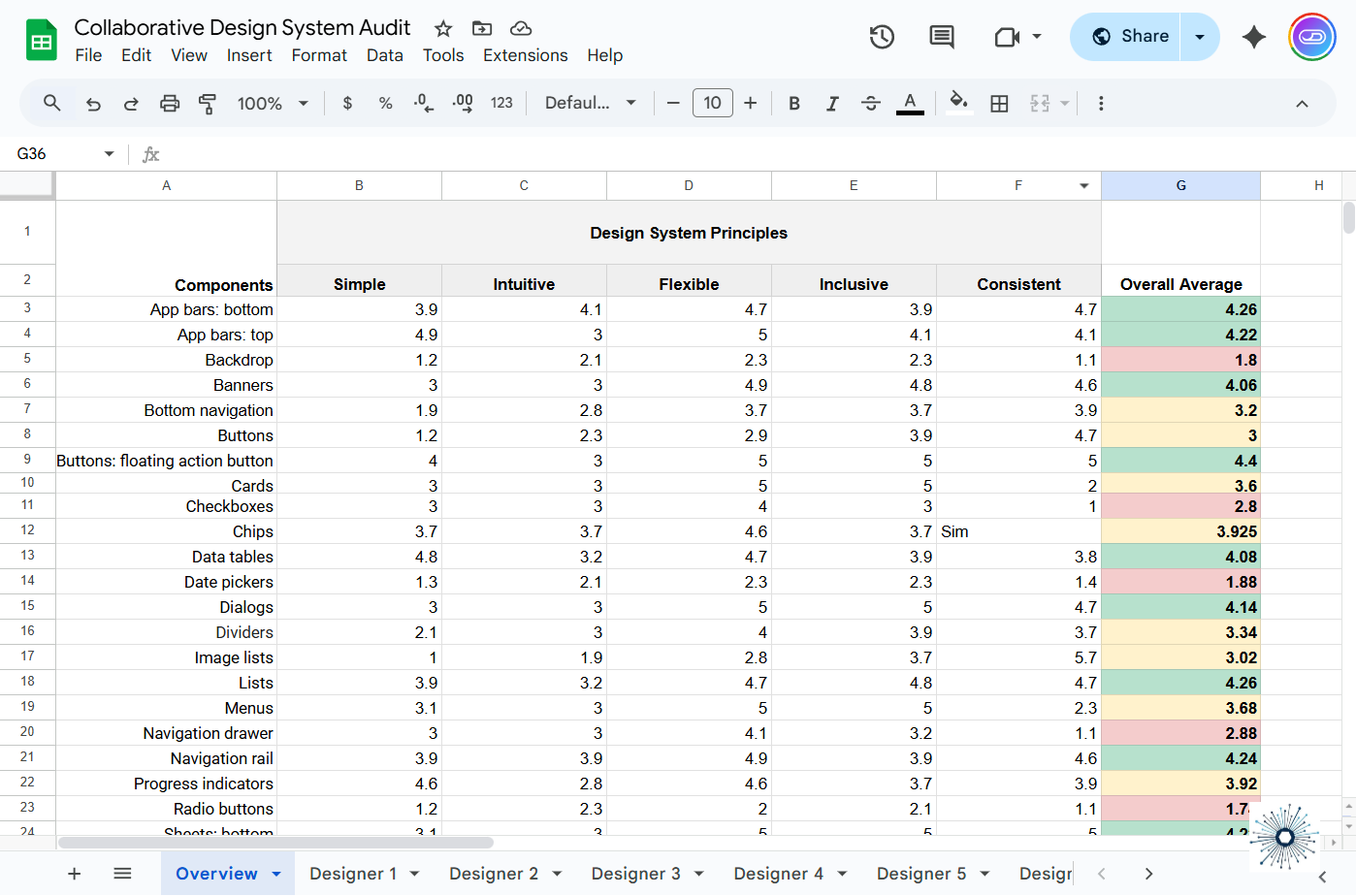
List all existing components (buttons, inputs, tabs, tooltips, etc.) in the first column of a shared spreadsheet.
List your principles across the top row — they become your grading criteria.
Score each component using a 5-point Likert scale per principle.
5 = fully meets principle
1 = doesn’t meet it at all
Facilitate a scoring workshop with your team:
Walk through one component at a time.
Let each team member score independently.
Gather comments, especially where scores are low.
Review the aggregated scores:
The average per component reveals which elements are working — and which need attention.
Conditional formatting (green/yellow/red) gives a quick visual summary of team sentiment.
Low-scoring components surface as redesign priorities. High-scoring ones? They’re your system heroes — likely good candidates for reuse and future system expansion.
Try It Yourself
Want to run this prioritization method with your team? Just grab a copy of the template below. Go to File > Make a Copy to create an editable version. The default component list is based on Google’s Material Design, but it’s fully editable — swap in your own labels, principles, or scoring logic. Just be sure to update formulas across all sheets accordingly.
This activity doesn’t just surface low-quality components — it surfaces alignment gaps, principle disagreements, and potential ownership disputes. That’s not a bug — it’s a feature. You’re creating shared language and surfacing disagreement early, before it becomes technical debt later.
And in large organizations, alignment is often the hardest part of system design.
Tools like Figma shape the artifacts, but tools like Excel can help shape the conversation.


