

How Designer Ego Broke the Interface
#034: Why design’s return to texture and motion feels more like performance than progress.

When design performs for itself, the user becomes an audience instead of a participant.
For the better part of the last decade, digital design has lived in an age of restraint. Flat color palettes, soft neutrals, geometric sans-serifs, and interfaces so rational they nearly disappeared into the background. It was the aesthetic of logic and efficiency; the visual language of the machine age translated for the screen.
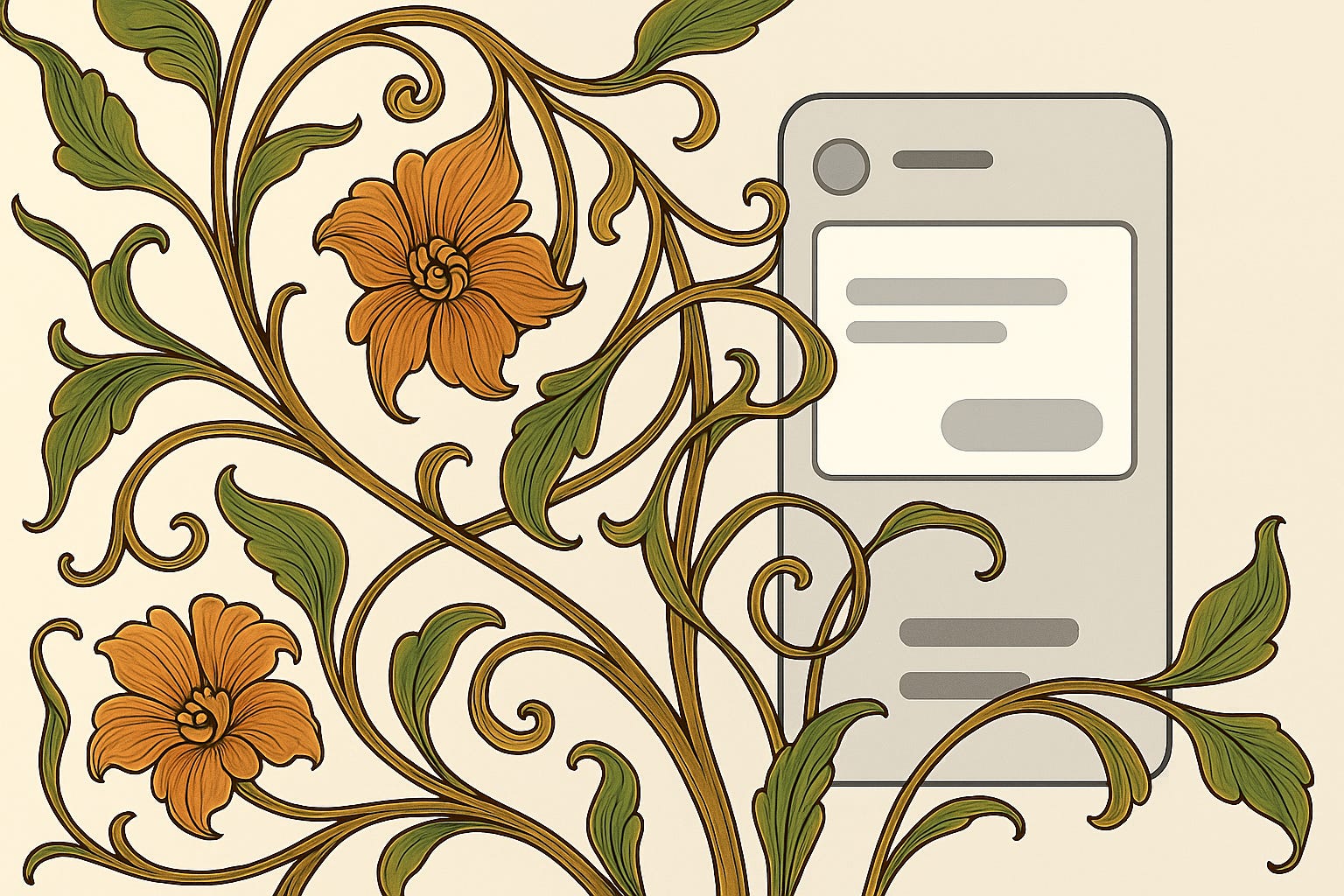
But every age of restraint eventually triggers its opposite. In the late 19th century, the mechanical efficiency of the Industrial Revolution gave rise to Art Nouveau, a movement that rebelled against mass-produced sameness through hand-crafted ornamentation, natural forms, and flowing lines. Its beauty was a protest — a reminder that even in an age of machines, a human’s touch still mattered.

Over a century later, digital design is having its own Art Nouveau moment. After years of minimalism and systems thinking, we’re seeing a similar backlash against uniformity — interfaces that shimmer, animate, and emote. Apple’s “Liquid Glass” gleams like jewelry. Airbnb’s redesign moves with cinematic rhythm, every transition a performance. Many modern car’s interiors seem designed more to be photographed than driven. Even Tesla’s Cybertruck — whose brutalist geometry I find visually exhausting — is a product of this same impulse: design as statement, spectacle for its own sake at the expense of function.
The parallels are hard to miss. Art Nouveau tried to restore the soul of the handmade to a world that had become too mechanical; today’s “extra” era is trying to re-infuse digital products with the emotional richness we stripped away in the name of scalability and systemization. Both were born out of a need to restore feeling to a world that had grown too mechanical, and both tend to confuse expression with empathy. Some of those exquisitely curved Art Nouveau chairs weren’t exactly comfortable to sit in, but they looked alive — vibrant, organic, almost breathing.
Today’s trendy interfaces share that same energy: dazzling, expressive, and sometimes just as uncomfortable to live with. They remind us how easily the pursuit of emotional richness can slip into theatricality, how a design that aims to feel human can still forget the human using it.
Across industries, design is rediscovering ornament, movement, and emotional weight after a decade of deliberate minimalism. But somewhere in this rush to feel again, we’ve lost sight of why design exists in the first place.
When “Extra” Had a Purpose
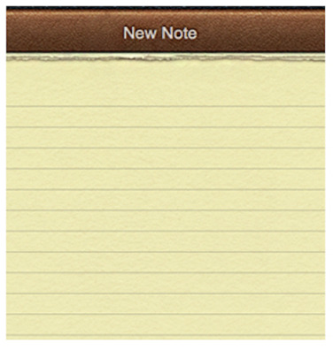
This isn’t the first time digital design has gone over the top. Long before flat design, there was skeuomorphism — the era of stitched leather, wood grain, and metal textures that defined early iOS. The Game Center looked like a casino table lined in green felt, Notes mimicked yellow legal paper, and the calculator was modeled after a Braun original, glossy buttons and all.
It’s easy to laugh at now, but those design choices weren’t arbitrary. They served a very real purpose beyond being fun for designers to create.
We were moving from interacting with computers through peripherals — mice, keyboards, dials — to touching pure glass. Skeuomorphism made that leap feel natural. When a button looked like a button, you knew you could press it. It gave users the visual confidence to trust touch. It wasn’t solely decoration; it was instruction.
Skeuomorphism was scaffolding that helped us adapt to a new medium, and once we learned, Apple took it away.
The Age of Restraint
In 2013, Jony Ive — already legendary for his mastery of Apple’s hardware design — took over the company’s software design direction. With iOS 7, he led the charge into what became known as the Flat UI revolution, stripping away textures, gradients, and shadows in favor of a cleaner, more “honest” aesthetic. Ive saw the digital interface and the physical device as parts of the same unified product, and his goal was to design in a way that respected both. If skeuomorphism was about translating the physical world into digital form, Ive’s philosophy was about embracing the digital medium for what it was.

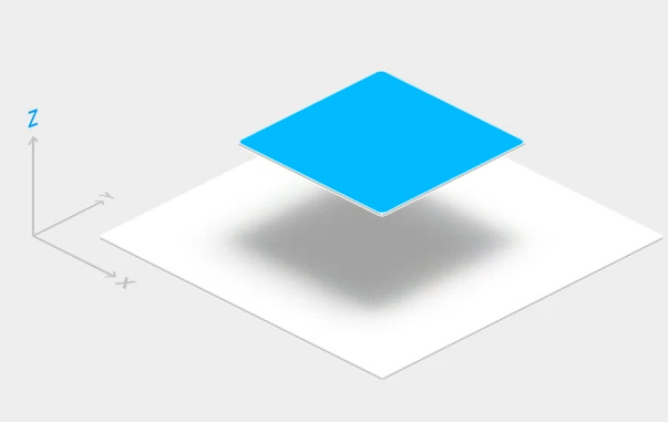
Google followed soon after with Material Design, a framework that found its own way to balance realism and restraint. Buttons subtly lifted upward to meet your finger on the glass, adding just enough depth to preserve affordance without clutter. It was thoughtful, measured, and deeply rational — design as geometry, movement, and light.
These two philosophies — Apple’s austere honesty and Google’s mathematically structured tactility — defined the visual language of the 2010s. They made design scalable, consistent, and accessible. They also made it safe and boring.
So it’s no surprise that designers have grown restless. The pendulum, as it always does, has swung the other way.
Design’s “Extra” Era
Today’s “extra” moment is the backlash. Designers are reaching again for texture, motion, and depth in an effort to reclaim feeling. But the outcomes vary wildly in purpose and restraint.
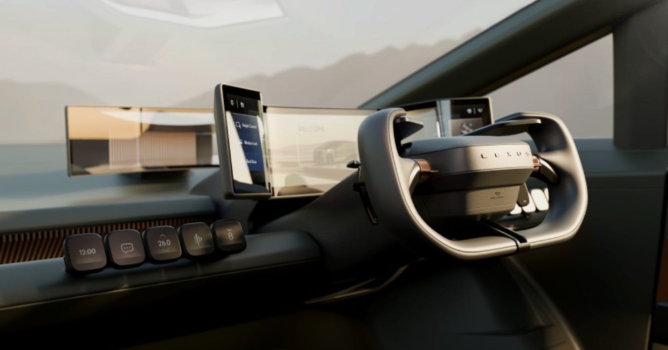
Apple’s Liquid Glass feels luxurious but verges on spectacle. Airbnb’s redesign is beautiful yet sometimes distractingly choreographed. Lexus’s concept interiors drip with futurist fantasy, while Tesla’s Cybertruck embodies the opposite kind of maximalism — cold, aggressive, and performative in its defiance of beauty. I may not like it, but it’s a perfect example of the same underlying phenomenon: design for design’s sake.

All of these examples share one thing in common — they want to be noticed. They remind us they were designed. And that’s precisely the problem.
When design performs for itself, the user becomes an audience instead of a participant. The more we draw attention to the chrome of an experience, the less we focus on why it exists at all. It’s like admiring a statue in the lobby without being able to find the elevator. Beautiful, maybe — but you’re still stuck. When ornamentation becomes the point, usability and design for quick and seamless comprehension takes a back seat.
A Personal Reminder of Why This Matters
I was reminded of this tension recently after switching phones. I’d been using an iPhone 15 Pro Max, but the arrival of iOS 26 pushed me over the edge. The update bogged down performance and introduced Apple’s new Liquid Glass aesthetic, which added visual noise where there used to be calm. Buttons shimmered, text blurred through transparency, and the entire system seemed intent on making me notice it. The polish was undeniable, save for the apps where it was simply broken, but so was the fatigue.
This week I switched to a Pixel 10. It’s Google’s own hardware, which means it runs the purest — and frankly blandest — version of Android. And that’s exactly what I love about it. The interface feels simple, fast, and clear. It has just enough animation to reinforce understanding, but it never competes with the content. The overly “Expressive” qualities of Material 3 Expressive — dynamic themes, wallpaper-driven palettes — are optional flourishes. They make the device feel more personal, not more performative. It’s calm, measured design that supports what I’m doing, not how the software wants to be perceived.
After just a few days, it’s striking how refreshing boring design can feel after a short experience fighting with Apple’s new over-the-top design language.
A Better Kind of “Extra”
That’s the balance we’ve been missing — emotion without ego. Design that feels alive but doesn’t ask to be admired.
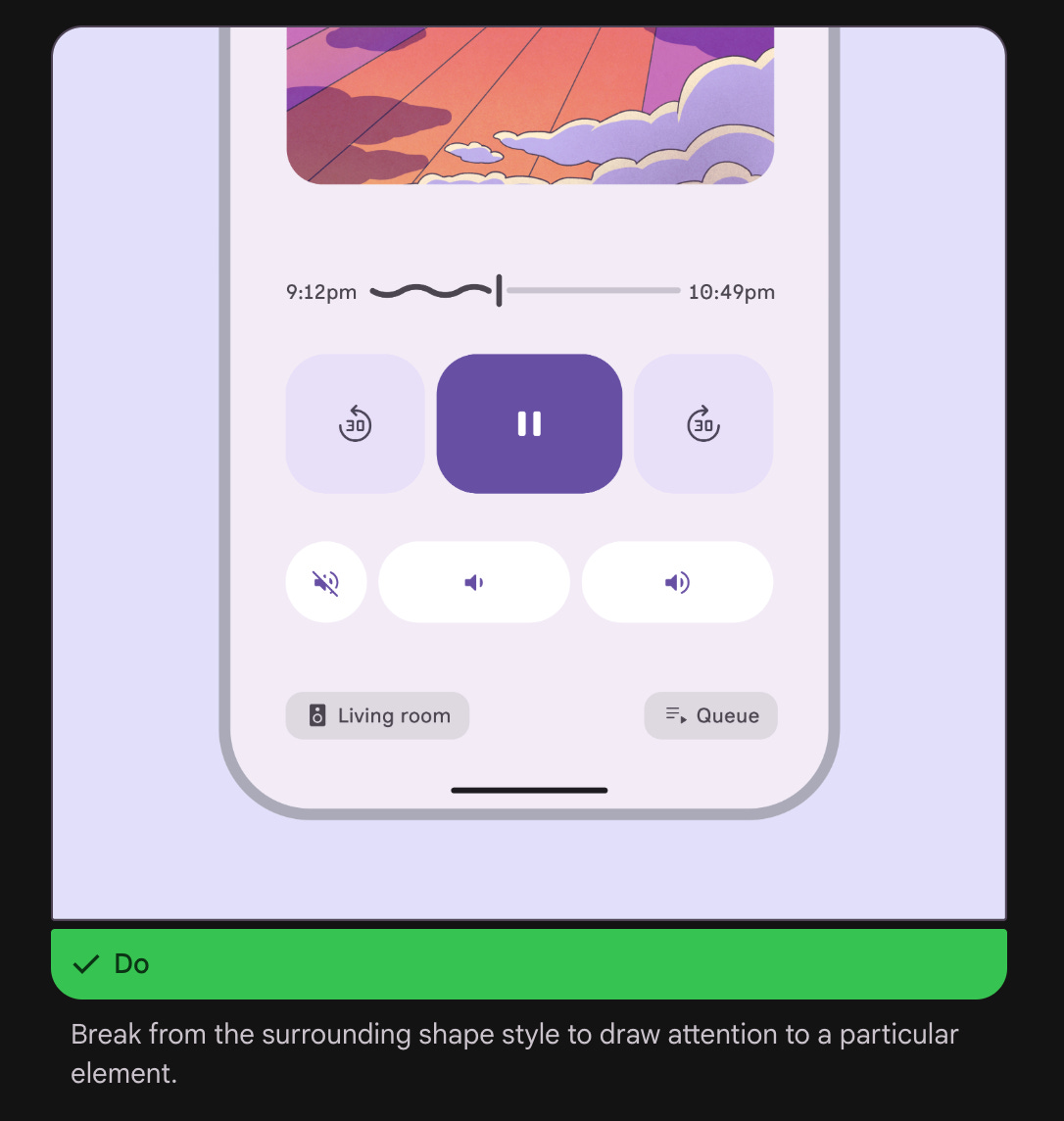
Google’s Material Expressive points in that direction — a framework that reintroduces shape, color, and motion with clear purpose. Its “extra” isn’t for attention; it’s for comprehension. It’s the kind of design that reminds you what emotion can do when it’s in service of understanding.
The Pendulum and the Lesson
Design’s “extra” era was inevitable. After years of reductionism, we were bound to crave personality again. But we shouldn’t mistake this swing toward embellishment for progress. Skeuomorphism was extra for a reason — it helped people learn to use a new medium. Ive’s flat design shift was honest for a reason — it helped digital mature into something independent and confident, re-contextualizing hardware and software as parts of the same whole. Today’s excess, by contrast, often feels like decoration in search of justification, an aesthetic trying to fill the emotional void left by our obsession with efficiency.
The best design has never been defined by whether it’s flat, glossy, or animated. It’s defined by whether it helps people accomplish what they came to do — without friction, confusion, or spectacle. Unfortunately, it seems the popular trend today is for design to do the opposite in service of its creator’s ego.