

The Best Digital Product Design Isn't Happening at Apple
#001: Apple’s new Liquid Glass design language is a step backward in accessibility — and a reminder that visual polish is not the same as vision.

At WWDC this week, Apple announced Liquid Glass: the first major redesign of its software since Jony Ive’s flat UI became an institution in 2013 with iOS 7.
The goal is to further blur the lines between physical and digital by making the interface feel like it’s made of the same glass as the hardware that houses it. Skeuomorphism… again, but shinier and more translucent.
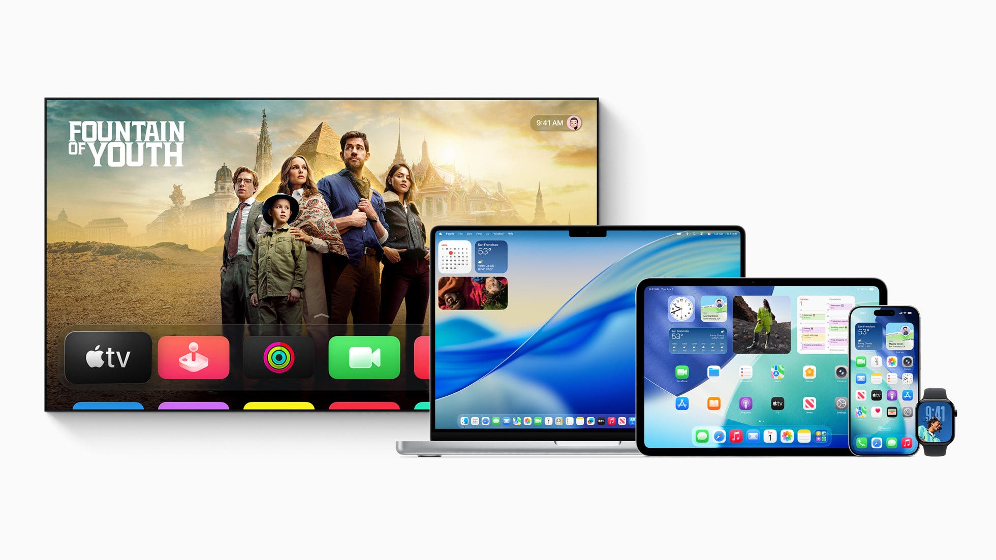
Everyone's entitled to their own opinion on the aesthetics, but one thing is undeniable: there are blatant accessibility issues. In the current dev build and in the on-stage demos, text often fades into its surroundings, undermining legibility and usability. The below screenshot from Apple's website shows a clear example of navigation blending into a busy background.
 — is practically illegible due to the translucent nature of its background and its placement over a busy photo gallery UI.")
All this could change before launch, but Apple chose to showcase it this way, knowing full well the implications. That was also a poor design decision.
My other gripe is: What’s the why? Why should anyone care?
Liquid Glass borrows from Vision OS and feels more like a visual remix than a product of thoughtful design evolution. There’s no clear rationale beyond “it looks cool” and “your Apple devices are made of glass, so…”
Meanwhile, Google’s Material Design team continues to lead with clarity.
Back in 2014, Material’s metaphor of digital surfaces “eagerly rising to meet your touch” offered poetic precision and interaction logic for Android phones and tablets.

Last year, Material You brought vibrant, personalized design at scale.
This year, Material Expressive leaned further into creativity, all backed by research showing that most people prefer visually delightful experiences.
Some folks are crediting Apple for now “giving designers permission to be creative and bold again.” I disagree. That permission has been available for years — just not from Apple.
It’s Google’s Design team that’s been leading the way: bold, intentional, grounded in clear principles, and focused on the people actually using the products, not just those watching the stage demos.
I still use an iPhone as my daily driver, but credit where it’s due: Google is the stronger software design company and has been for years. It’s just unfortunate that Android’s fragmented hardware and platform strategy continues to hold that great design back.